Games UX for Kids
Discipline
UX Research
Game Design
EdTech
Role
Research lead
Facilitator
Content Design
Prototyping
Timeline
August 2023
May 2024
Client:
Iconsultancy
Goal: Create a game to create comfort with math
Solution:
Engaging game prototype with game design and developer documentations
MATHVENTURES
An art-forward educational math game for kids

Let's help young minds gain confidence and comfort with math
Painting the Canvas of Innovation
Over the span of 7 months, our team of 5 redesigned an educational game aimed to foster a positive relationship with math among children aged 5 to 11 for our client Dr. Hill.
While i had no experience in UX for kids, I had worked on designing kidswear :)
Excited, nervous yet optimistic. I was excited to embark on this new journey through a researcher's lens. I like to call it
" The chronicles of Math and Colors"

The Prologue
Before deep diving into the project, i set out to understand the problem space, buried myself in research papers and assess if there is really a need for such an app.? Indeed, there was..
20% to 25% of kids experience at least some math anxiety, and it often lasts into adulthood.

Did you know?
Why combine
Math and Play?
To comprehensively grasp the customer journey and enhance their user experience, our attention centered on a critical aspect.
Play-based learning can be beneficial for all students and offers various ways to learn and display mathematical knowledge.
.png)
Lessons from the Prequel
Taking on the project from a previous team, the first thing we did was having meetings with the clients, parents and UX experts from the previous team to gain insights into what worked vs what didn't work in version one. We found the game included several elements that took away from the aim of the app being relaxing and did not include enough pause times often needed for retention in learning.

Previous Design
Issues Identified
The Vision: Reframed
We spent a total of 2 weeks trying to establish the vision for the app with the client. The goal became to redesign the app for flexibility, creativity, and positive engagement. More like Re-framed.. Get the pun ;)

Bring back the Zen,
they said..

How might we?

Challenge accepted,
we said..
BEHIND THE SCENES
The Process
The overall process was a modified version of Google Venture Design Sprint methodology. We conducted 5 sprints, spaced across our 9 month timeline. We divided our project stages across the span of 2 weeks instead of the typical daily approach.

The Journey
Repeat
Our journey involved several twists or and turns but we made it and it makes for a great story :) Here's my attempt at summarizing 7 months of innovation and sometimes chaos, made for our client presentation.
.png)
THE
COVER PAGE
Our Solution
Crafted with passion and pride, mixed with sweat and tears
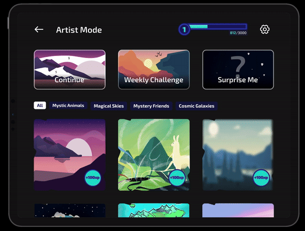
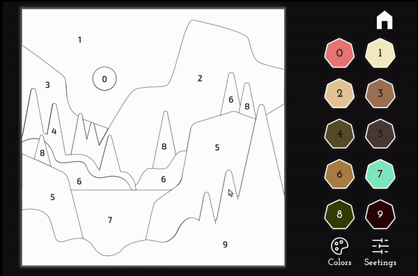
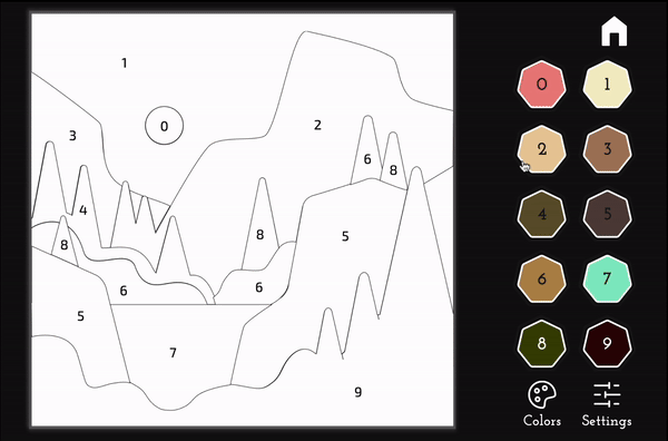
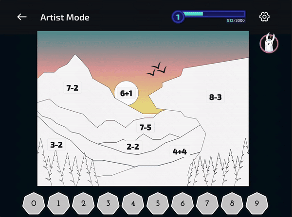
1. Artist Mode
A paint by number/ equation style game feature which includes:
-
Gallery of themed paintings to choose from with category filters.
-
Weekly challenges to keep users engaged
-
"Surprise Me" feature to generate a unique painting
-
Difficulty and operation options for varied learning levels.
For the creatively driven


Interface
Artist's gallery
Game play
A progressive mode of game play aimed to challenge the users.
-
progressively increasing difficulty levels.
-
Operation based Islands
-
Tutorial island to help teach the game
-
Difficulty and operation options for varied learning levels.
-
Island Map that unlocks areas as you progress


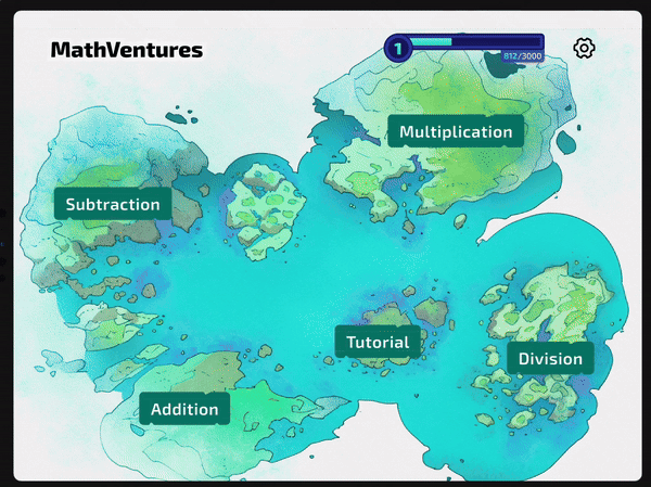
2. Adventure Islands
Tutorial island
Level based progression
For the goal driven
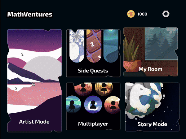
3. My Room
For the reward driven
A paint by number/ equation style game feature which includes:
-
Earn rewards by completing levels
-
Cosmetic rewards with multiple choices
-
Customize 'Room' with earned rewards
-
Frame paintings completed in gallery

Cosmetic Rewards

Customize your room

Frame completed paintings
How did we Get here?
We started off having little knowledge about designing for kids and little domain knowledge about the market for kids apps.
LEARNING THE PROBLEM SPACE
Burning questions I had-
What's out there in the market?
What are the standards for apps for young users?
What are the needs and wants of our users?
How do we conduct research fow and with kids?
As a research lead , how did I find answers around these?
.png)
Research from previous team
Competitive & Market Analysis
Spoke to UX designer
analysed affinity notes
User testing results
Parental Feedback
Spoke to UX designer
analysed affinity notes
User testing results
Parental Feedback
Research papers, Edtech blogs
Spoke to UX designer
analysed affinity notes
User testing results
Parental Feedback
Expert Interviews
Spoke to UX designer
analysed affinity notes
User testing results
Parental Feedback
FINDINGS AND GUIDELINES CREATED
Based on my findings, I created a few guidelines for our team before we started our design and research phase, Which included principles, unique needs, preferences and best practices
.png)
DESIGN,
PROTOTYPE,
TEST,
REFINE.
Based on expert guidelines of researching with kids, I found that testing with realistic prototypes was the best way to get authentic feeback and insights with kids.
We began picking a design goal, creating lo-fi wireframes, voting on solutions, rapid prototyping and finally testing. We followed this process for each sprint.
Let the Design Chaos begin
DESIGN
Challenge 1
Prioritizing the main feature the client wanted, our first design goal was set.
How might we integrate a user-friendly paint-by-numbers mode into our existing app?
Ho might we make it engaging mode that provides freedom of choice to users?
I'm focusing on this key function as this where i played the major role
as-
Facilitator
Research lead
Prototyper
Birth of
ARTIST MODE

Wireframes and Voting

Creating a 4 screen Flow
The AIM
To provide choice in:
-
paintings
-
operations
-
difficulty
-
colors

Hi-fidelity screens from existing style guide
Advanced prototyping on Figma
TESTING Session 1
TESTING
with kids, a new skill
We planned a testing session with the KidsTeam at UMD with 9 users ranging from the age 6-11 years. As the facilitator and researcher, I devised the session plan and led the session.
The Process
-
Snacks first to break power dynamics
-
Each session started with a “Question of the Day” to prompt thoughts about the day's content.
-
Briefed kids about the game and asked them to act as experts.
-
Divided into smaller groups with adult supervisors per team to test the prototype and observe kids
-
Methods like likes/dislikes/big ideas, and storyboarding were used to evaluate the design.
The Challeneges
-
Peer Influence affected authenticity of insights during group exercises. Asking users "Why" helped mitigate this
-
Had to take their grand and out-worldly ideas and pull out deeper meanings to form insights.
-
Fell short of time compared to plan as sometimes kids got distracted and wanted to do other things instead. It was important to be patient and adaptable.

The Learning
It was more productive to have kids explore the protoype on their own while we observed and occasionally asked them questions to understand the why's rather than follow a structured task list. They don't like to be forced!
Having a full functioning protoype prevented any restriction, allowing them to explore while we made notes on first clicks, moments of excitement and frustrations.
KEY ISSUES
Brought to light
Observation played a key role in gaining insights regarding the usability of the designs. Storyboard and reflection activities helped us gain qualitative insights
into what the kids truly think, want and feel.
Customization:
Users LOVED the idea of being able to choose paintings and colors of their choice,
However, the icons for operations were unclear for users.
Younger users wanted skip the difficulty controls screen and start the game.
Usability:
The double column, number palette was confusing for users
Users were unable to figure out where to click first, the number or the canvas?
Layout of interface and placement of functions was not intuitive for users
Copy:
The Terms "ARTIST MODE" and 90% of users clicked on it first as they opened the app.
The "Surprise Me" button was well liked by users as it generated curiosity.
Users loved the idea of "themed color palettes" with labels like fall, winter
Learning:
Users did not try to solve a problem, due the highlight that showed up as a number was clicked.
The ease level of problems made it less affective for older kids.
Users expressed the need for help when they were stuck and couldnot solve the problem.
Improvements made after testing
Interactions
Removed Selection overlay when a number is selected.
Although it makes the game harder, it boosts learning and problem solving
Added feedback to make numbers disappear, reducing cognitive load and creating a sense of completion
Version 1
Without overlay
Layout
A/B tested versions to improve layout and move the color palette to the bottom and controls to the top right, with addition of a progress bar

Version 1
Game Play
Mechanism
Changed the game play mechanism to
Click on a problem >
The the number
To match the mental model of solving math problems
Refined layout
Positive Reinforcement
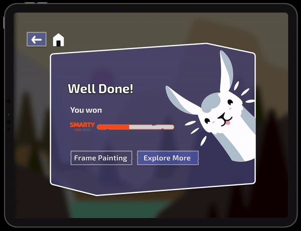
Added interactive completion screens for greater feedback, improved sense of achievement and positive reinforcement
for kids
Hint Mechanism
Researched visual models and created visual representations of a problem and encourages asking for help when stuck on a problem.

Replay your paintinng
XP progress bar
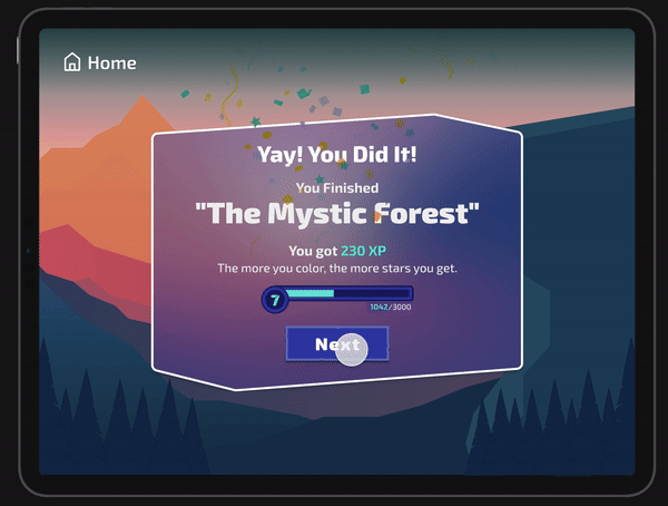
Earn Rewards
Improved overall visual design to reduce cognitive load
Beyond Screens
My Role as a researcher has me create all visual models for the client with an aim to visually represent our research findings, journey maps and User Flows..
Our reserach and testing for multiple sessions helped me make valuables artifact that helped us form the guidelines for all features of the game.


Design for endless
possibilities and exploration
Design for
low cognitive
abilities


Design for creative control
Design for engagement
Once the game mode was tested, i led the team to create a comprehensive journey map and emotion graph a user goes through when playing the game mode..which led to identifying problems we needed to address in version 2


The Outcome

-
User-Centric Iteration: Incorporating key insights from kids during testing sessions, fostered a sense of acknowledgement and significantly enhanced their engagement through each sprint.
-
Stakeholder Satisfaction: Stakeholders were beyond moved by the visual and functional quality of the product and the data driven process that we followed.
-
Seamless Handoff: Successfully delivered a high fidelity prototype of the game to our client, along with a comprehensive design system, documentations as well as pitch decks for marketing.